Logit Lens로 SAE 특징 이해하기
이 노트북은 "Logit Lens로 SAE 특징 이해하기" 게시물에 문서화된 분석을 수행하기 위해 mats_sae_training 라이브러리를 사용하는 방법을 보여줍니다.
따라서 이 노트북에는 다음 섹션이 포함됩니다:
- Huggingface에서 GPT2-Small Residual Stream SAE를 로드하기.
- 특징에 대한 가상 가중치 기반 분석 수행 (특히 logit 가중치 분포를 살펴봄).
- neuronpedia에서 공용 대시보드를 사용하기 위해 Neuronpedia 탭을 프로그래밍 방식으로 열기.
- 토큰 세트 강화 분석 수행 (Gene Set Enrichment Analysis를 기반으로).
설정
여기서는 다음과 같은 작업을 위한 다양한 함수를 로드합니다:
- Huggingface에서 SAE를 다운로드하고 로드하기.
- Jupyter 셀에서 Neuronpedia 열기.
- Logit 가중치 분포의 통계 계산.
- 토큰 세트 강화 분석(TSEA)을 수행하고 결과를 시각화하기.
import
import os
from setproctitle import setproctitle

setproctitle("공대생 도전 일지")
os.environ["CUDA_VISIBLE_DEVICES"] = "0"
항상하는 이름 설정이랑 gpu번호 정하기!
try:
    # For Google Colab, a high RAM instance is needed
    import google.colab # type: ignore
    from google.colab import output
    %pip install sae-lens transformer-lens
except:
    from IPython import get_ipython # type: ignore
    ipython = get_ipython(); assert ipython is not None
    ipython.run_line_magic("load_ext", "autoreload")
    ipython.run_line_magic("autoreload", "2")
import numpy as np
import torch
import plotly_express as px
from transformer_lens import HookedTransformer
# Model Loading
from sae_lens import SAE
from sae_lens.analysis.neuronpedia_integration import get_neuronpedia_quick_list
# Virtual Weight / Feature Statistics Functions
from sae_lens.analysis.feature_statistics import (
get_all_stats_dfs,
get_W_U_W_dec_stats_df,
)
# Enrichment Analysis Functions
from sae_lens.analysis.tsea import (
get_enrichment_df,
manhattan_plot_enrichment_scores,
plot_top_k_feature_projections_by_token_and_category,
)
from sae_lens.analysis.tsea import (
get_baby_name_sets,
get_letter_gene_sets,
generate_pos_sets,
get_test_gene_sets,
get_gene_set_from_regex,
)GPT2 Small 및 SAE 가중치 로드하기
처음 실행할 때는 시간이 걸리지만, 이후에는 빠르게 실행됩니다.
model = HookedTransformer.from_pretrained("gpt2-small")
# this is an outdated way to load the SAE. We need to have feature spartisity loadable through the new interface to remove it.
gpt2_small_sparse_autoencoders = {}
gpt2_small_sae_sparsities = {}

for layer in range(12):
    sae, original_cfg_dict, sparsity = SAE.from_pretrained(
        release="gpt2-small-res-jb",
        sae_id="blocks.0.hook_resid_pre",
        device="cpu",
    )
    gpt2_small_sparse_autoencoders[f"blocks.{layer}.hook_resid_pre"] = sae
    gpt2_small_sae_sparsities[f"blocks.{layer}.hook_resid_pre"] = sparsity
특징 Logit 분포의 통계적 속성
게시물에서 나는 특별한 이유 없이 8번째 레이어를 연구했습니다. 이 노트북의 끝에는 모든 레이어에 걸쳐 이러한 통계들을 시각화하는 코드가 있습니다. 여기에서 레이어를 변경하고 다른 레이어를 탐색해 보세요.
# In the post, I focus on layer 8
layer = 8

# get the corresponding SAE and feature sparsities.
sparse_autoencoder = gpt2_small_sparse_autoencoders[f"blocks.{layer}.hook_resid_pre"]
log_feature_sparsity = gpt2_small_sae_sparsities[f"blocks.{layer}.hook_resid_pre"].cpu()

W_dec = sparse_autoencoder.W_dec.detach().cpu()

# calculate the statistics of the logit weight distributions
W_U_stats_df_dec, dec_projection_onto_W_U = get_W_U_W_dec_stats_df(
    W_dec, model, cosine_sim=False
)
W_U_stats_df_dec["sparsity"] = (
    log_feature_sparsity  # add feature sparsity since it is often interesting.
)
display(W_U_stats_df_dec)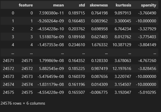
이 표는 Sparse Autoencoder (SAE)의 특징(feature) 벡터에 대한 다양한 통계 정보를 나타낸 표입니다. 각 특징(특정 뉴런 또는 활성화 값)에 대해 평균, 표준편차, 왜도, 첨도, 희소성 등을 계산한 결과입니다. 이를 통해 각 특징이 데이터에서 어떻게 분포하는지에 대한 통찰을 제공합니다.
각 열의 의미를 차례대로 설명하겠습니다.
1. feature
- 이 열은 특정 특징(feature) 번호를 나타냅니다. 각 숫자는 SAE에서 추출한 특정 뉴런 또는 특징 벡터의 인덱스를 의미합니다.
- 예를 들어, feature 0은 첫 번째 뉴런에 대한 통계값을 나타내고, feature 24575는 마지막 뉴런에 대한 통계값입니다.
2. mean (평균)
- 이 열은 해당 특징 벡터의 평균 활성화 값을 나타냅니다.
- 평균 값이 0에 가까울수록, 해당 특징이 양수와 음수로 고르게 분포되어 있다는 것을 의미합니다.
- 예를 들어, feature 0의 평균은 7.59e-11로 거의 0에 가깝기 때문에, 이 뉴런의 활성화 값은 매우 균형 잡혀 있다고 볼 수 있습니다.
3. std (표준편차)
- 표준편차는 해당 특징 벡터의 활성화 값이 평균으로부터 얼마나 분산되어 있는지를 나타냅니다.
- 값이 클수록 해당 특징 벡터의 활성화 값이 다양한 범위로 분포되어 있음을 의미합니다. 값이 작을수록 활성화 값이 평균 근처에 집중되어 있습니다.
4. skewness (왜도)
- 왜도(skewness)는 분포의 비대칭성을 나타냅니다.
- 양수의 왜도: 활성화 값이 오른쪽으로 치우친 분포를 의미합니다. 즉, 더 큰 값들이 종종 나타납니다.
- 음수의 왜도: 활성화 값이 왼쪽으로 치우친 분포를 의미합니다. 즉, 작은 값들이 더 자주 나타납니다.
- 왜도가 0에 가까울수록, 분포는 대칭적입니다.
- 예를 들어, feature 4의 왜도는 1.676332로 양수이므로, 해당 특징 벡터의 값이 크게 활성화되는 경우가 많다는 것을 의미합니다.
5. kurtosis (첨도)
- 첨도(kurtosis)는 분포의 꼭대기가 얼마나 뾰족한지 또는 평평한지를 나타냅니다.
- 양수의 첨도: 분포가 뾰족하며, 극단값(매우 큰 값 또는 작은 값)이 자주 나타나는 것을 의미합니다.
- 음수의 첨도: 분포가 평평하며, 극단값이 잘 나타나지 않고, 중간 값에 집중된 분포를 의미합니다.
- 예를 들어, feature 4의 첨도는 10.387129로 매우 높습니다. 이는 해당 특징이 극단적인 활성화 값을 자주 가지며, 매우 드문 경우에 매우 큰 값을 나타낼 수 있다는 것을 의미합니다.
6. sparsity (희소성)
- 희소성(sparsity)는 해당 특징이 얼마나 자주 0에 가까운 활성화 값을 갖는지 나타냅니다.
- 음수 값은 특정 함수로 계산된 것으로, 값이 클수록(즉, 절대값이 클수록) 해당 특징이 자주 비활성화된다는 것을 의미합니다.
- 예를 들어, feature 1의 희소성 값은 -10.000000으로 매우 희소한 특징임을 나타냅니다. 즉, 이 뉴런은 대부분의 경우 활성화되지 않고, 주로 0에 가까운 값을 가집니다.
- 값이 적으면 해당 특징이 자주 활성화된다는 의미입니다.
이 표의 구성 및 활용
- 각 특징(feature)에 대한 다양한 통계값을 통해, 해당 특징이 데이터에서 어떻게 활성화되고, 얼마나 자주 중요한 역할을 하는지 이해할 수 있습니다.
- 평균(mean)과 표준편차(std)는 각 특징의 전반적인 분포를 설명하고, 왜도(skewness)와 첨도(kurtosis)는 해당 특징의 분포가 얼마나 비대칭적이거나 극단적인지를 설명합니다.
- 희소성(sparsity)은 해당 특징이 얼마나 자주 활성화되지 않는지(0에 가까운 값이 많은지)를 나타냅니다.
예시:
- feature 0: 평균적으로 거의 활성화되지 않으며(7.59e-11), 표준편차가 0.1897로 적당한 변동성을 보여줍니다. 왜도가 0.764이므로, 활성화 값이 다소 오른쪽(양수 쪽)으로 치우쳐 있습니다.
- feature 1: 평균이 거의 0에 가깝고(-9.26e-9), 매우 희소합니다(-10.000000의 희소성). 즉, 대부분의 경우 활성화되지 않는 뉴런입니다.
이 표는 모델의 특정 뉴런이나 특징이 텍스트 처리에서 어떤 역할을 하는지 분석하는 데 사용할 수 있습니다. 모델이 특정 주제나 패턴을 처리할 때 어떤 특징들이 더 자주 활성화되고, 어떤 특징들이 잘 사용되지 않는지를 파악할 수 있습니다.
네, 맞습니다! 희소성(sparsity)이 높고, 첨도(kurtosis)가 높다면 그 뉴런은 확실한 특징을 가지고 있다고 해석할 수 있습니다. 이 뉴런은 특정한 경우에만 활성화되고, 그 활성화는 강하게 나타나는 경향을 보일 것입니다.
왜 그런지 자세히 설명해드릴게요:
- 희소성(sparsity)가 높다는 의미:
- 희소한 뉴런은 대부분의 경우 비활성화(즉, 값이 0에 가깝거나 0)되어 있다가 특정 조건에서만 활성화됩니다.
- 즉, 특정한 입력이나 상황에서만 반응하는 뉴런이라는 뜻입니다.
- 예를 들어, 특정 주제나 패턴(종교적인 문맥, 기술적인 용어 등)이 등장할 때만 활성화되는 뉴런일 수 있습니다. 대부분의 입력에서는 거의 반응하지 않다가, 특정 상황에서만 활발하게 작동하는 특징을 가지고 있습니다.
- 첨도(kurtosis)가 높다는 의미:
- 첨도가 높다는 것은 뉴런의 활성화 값이 평소에는 0 또는 아주 낮은 값에 몰려 있다가, 극단적인 상황에서 높은 활성화 값을 가지는 경향이 있다는 뜻입니다.
- 즉, 극단적인 값(매우 큰 값)이 나올 때 그 뉴런은 매우 강하게 반응하는 특징을 보입니다. 이는 그 뉴런이 특정 패턴에 매우 민감하게 반응하며, 그런 상황에서 강하게 활성화된다는 의미입니다.
종합적으로:
- 희소하고 첨도가 높은 뉴런은 명확한 특징을 가지고 있다고 할 수 있습니다.
- 희소성이 높기 때문에 특정한 경우에만 활성화되며, 첨도가 높기 때문에 활성화될 때는 강하게 반응합니다.
- 이런 뉴런은 특정한 입력에 매우 강하게 반응하며, 이 뉴런이 활성화될 때는 특정한 특징(주제, 패턴 등)을 확실하게 나타내는 신호라고 해석할 수 있습니다.
예시:
만약 어떤 뉴런이 종교적인 용어가 등장할 때만 활성화되는 특징을 가지고 있다면, 이 뉴런은 평소에는 거의 반응하지 않다가, "God", "church", "faith" 등의 단어가 나타날 때 갑자기 강하게 반응할 것입니다. 이 경우, 그 뉴런은 종교와 관련된 확실한 특징을 나타낸다고 볼 수 있습니다.
이런 뉴런은 모델이 특정 상황에서 중요한 역할을 하는 뉴런으로 해석될 수 있습니다.
# Let's look at the distribution of the 3rd / 4th moments. I found these aren't as useful on their own as joint distributions can be.
px.histogram(
    W_U_stats_df_dec,
    x="skewness",
    width=800,
    height=300,
    nbins=1000,
    title="Skewness of the Logit Weight Distributions",
).show()

px.histogram(
    W_U_stats_df_dec,
    x=np.log10(W_U_stats_df_dec["kurtosis"]),
    width=800,
    height=300,
    nbins=1000,
    title="Kurtosis of the Logit Weight Distributions",
).show()
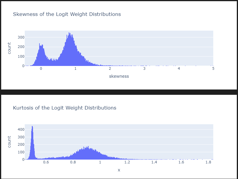
fig = px.scatter(
    W_U_stats_df_dec,
    x="skewness",
    y="kurtosis",
    color="std",
    color_continuous_scale="Portland",
    hover_name="feature",
    width=800,
    height=500,
    log_y=True,  # Kurtosis has larger outliers so logging creates a nicer scale.
    labels={"x": "Skewness", "y": "Kurtosis", "color": "Standard Deviation"},
    title=f"Layer {8}: Skewness vs Kurtosis of the Logit Weight Distributions",
)

# decrease point size
fig.update_traces(marker=dict(size=3))


fig.show()
# then you can query accross combinations of the statistics to find features of interest and open them in neuronpedia.
tmp_df = W_U_stats_df_dec[["feature", "skewness", "kurtosis", "std"]]
# tmp_df = tmp_df[(tmp_df["std"] > 0.04)]
# tmp_df = tmp_df[(tmp_df["skewness"] > 0.65)]
tmp_df = tmp_df[(tmp_df["skewness"] > 3)]
tmp_df = tmp_df.sort_values("skewness", ascending=False).head(10)
display(tmp_df)

# if desired, open the features in neuronpedia
get_neuronpedia_quick_list(sparse_autoencoder, list(tmp_df.feature))
토큰 세트 강화 분석
이제 토큰 세트 강화 분석을 진행하겠습니다. 이러한 결과를 깊이 이해하기 전에, 제 AlignmentForum 게시물(특히 사례 연구)을 읽어보는 것을 강력히 권장합니다.
또한 통계에 대한 전반적인 관점을 얻기 위해 이 게시물도 읽어보세요.
우리의 토큰 세트 정의
여기서 오류가 발생하기 때문에 이거 설치하고 가야됩니다.
import nltk


nltk.download('averaged_perceptron_tagger_eng')
import nltk
nltk.download("averaged_perceptron_tagger")
# get the vocab we need to filter to formulate token sets.
vocab = model.tokenizer.get_vocab() # type: ignore
# make a regex dictionary to specify more sets.
regex_dict = {
"starts_with_space": r"Ġ.*",
"starts_with_capital": r"^Ġ*[A-Z].*",
"starts_with_lower": r"^Ġ*[a-z].*",
"all_digits": r"^Ġ*\d+$",
"is_punctuation": r"^[^\w\s]+$",
"contains_close_bracket": r".*\).*",
"contains_open_bracket": r".*\(.*",
"all_caps": r"Ġ*[A-Z]+$",
"1 digit": r"Ġ*\d{1}$",
"2 digits": r"Ġ*\d{2}$",
"3 digits": r"Ġ*\d{3}$",
"4 digits": r"Ġ*\d{4}$",
"length_1": r"^Ġ*\w{1}$",
"length_2": r"^Ġ*\w{2}$",
"length_3": r"^Ġ*\w{3}$",
"length_4": r"^Ġ*\w{4}$",
"length_5": r"^Ġ*\w{5}$",
}
# print size of gene sets
all_token_sets = get_letter_gene_sets(vocab)
for key, value in regex_dict.items():
gene_set = get_gene_set_from_regex(vocab, value)
all_token_sets[key] = gene_set
# some other sets that can be interesting
baby_name_sets = get_baby_name_sets(vocab)
pos_sets = generate_pos_sets(vocab)
arbitrary_sets = get_test_gene_sets(model)
all_token_sets = {**all_token_sets, **pos_sets}
all_token_sets = {**all_token_sets, **arbitrary_sets}
all_token_sets = {**all_token_sets, **baby_name_sets}
# for each gene set, convert to string and print the first 5 tokens
for token_set_name, gene_set in sorted(
all_token_sets.items(), key=lambda x: len(x[1]), reverse=True
):
tokens = [model.to_string(id) for id in list(gene_set)][:10] # type: ignore
print(f"{token_set_name}, has {len(gene_set)} genes")
print(tokens)
print("----")
features_ordered_by_skew = (
    W_U_stats_df_dec["skewness"].sort_values(ascending=False).head(5000).index.to_list()
)
# filter our list.
token_sets_index = [
    "starts_with_space",
    "starts_with_capital",
    "all_digits",
    "is_punctuation",
    "all_caps",
]
token_set_selected = {
    k: set(v) for k, v in all_token_sets.items() if k in token_sets_index
}
# calculate the enrichment scores
df_enrichment_scores = get_enrichment_df(
    dec_projection_onto_W_U,  # use the logit weight values as our rankings over tokens.
    features_ordered_by_skew,  # subset by these features
    token_set_selected,  # use token_sets
)
manhattan_plot_enrichment_scores(
    df_enrichment_scores, label_threshold=0, top_n=3  # use our enrichment scores
).show()
이 코드는 토큰 집합(token sets)에 대해 enrichment score(풍부도 점수)를 계산하고, 이를 시각화하는 과정입니다. 아래는 이 코드의 각 부분을 차근차근 설명한 것입니다.
1. 토큰 집합 필터링
token_sets_index = [
"starts_with_space",
"starts_with_capital",
"all_digits",
"is_punctuation",
"all_caps",
]
token_set_selected = {
k: set(v) for k, v in all_token_sets.items() if k in token_sets_index
}- 설명:
- token_sets_index: 이 리스트는 선택된 특정 토큰 집합들의 이름을 나열하고 있습니다. 여기서는 다섯 가지 조건을 기준으로 토큰들을 선택합니다:
- "starts_with_space": 공백으로 시작하는 토큰들
- "starts_with_capital": 대문자로 시작하는 토큰들
- "all_digits": 숫자로만 이루어진 토큰들
- "is_punctuation": 구두점만으로 이루어진 토큰들
- "all_caps": 모두 대문자인 토큰들
- token_set_selected: all_token_sets라는 사전에서 token_sets_index에 해당하는 토큰 집합들만 추출해서 저장합니다. 즉, 사전에서 선택된 다섯 가지 조건에 맞는 토큰들을 필터링합니다.
- token_sets_index: 이 리스트는 선택된 특정 토큰 집합들의 이름을 나열하고 있습니다. 여기서는 다섯 가지 조건을 기준으로 토큰들을 선택합니다:
2. enrichment score(풍부도 점수) 계산
df_enrichment_scores = get_enrichment_df(
dec_projection_onto_W_U, # use the logit weight values as our rankings over tokens.
features_ordered_by_skew, # subset by these features
token_set_selected, # use token_sets
)- 설명:
- 이 부분은 풍부도 점수(enrichment scores)를 계산하는 코드입니다. 풍부도 점수는 주어진 특징(feature)이 선택된 토큰 집합에서 얼마나 자주 나타나는지를 계산하는 방법입니다. 각 토큰 집합에 대해 그 집합 내에서 특정 특징이 얼마나 풍부한지 평가합니다.
- dec_projection_onto_W_U: 이 매개변수는 로짓(logit) 값에 해당하는 가중치 또는 토큰에 대한 예측 순위입니다. 이 값을 사용해 토큰들의 순위를 매깁니다.
- features_ordered_by_skew: 특징(feature)의 목록이며, 이 특징들을 순서대로 정렬한 것입니다. 이 특징들에 대해 풍부도 점수를 계산합니다.
- token_set_selected: 앞에서 필터링한 토큰 집합을 사용하여, 이 집합에서 각 특징이 얼마나 자주 등장하는지를 평가합니다.
3. Manhattan plot 생성 및 시각화
manhattan_plot_enrichment_scores(
df_enrichment_scores, label_threshold=0, top_n=3 # use our enrichment scores
).show()- 설명:
- Manhattan plot은 enrichment score를 시각화하는 데 사용되는 그래프 형식입니다. 이 플롯은 각 특징이 특정 토큰 집합에서 얼마나 풍부하게 나타나는지를 보여줍니다.
- df_enrichment_scores: 앞서 계산한 풍부도 점수 데이터프레임을 시각화하는 데 사용됩니다.
- label_threshold=0: 특정 점수 이상인 항목에만 라벨을 붙이도록 설정할 수 있는데, 여기서는 0으로 설정해서 모든 점수에 라벨을 표시하도록 하고 있습니다.
- top_n=3: 풍부도 점수가 가장 높은 상위 3개의 특징만을 표시합니다.
- .show(): 그래프를 화면에 출력합니다.
Manhattan Plot 설명:
- 이 플롯은 토큰 집합과 특징 간의 연관성을 시각적으로 보여주는 방법입니다. 특정 집합에서 특징이 얼마나 자주 나타나는지를 높이로 나타내며, 풍부도가 높을수록 해당 토큰 집합에서 그 특징이 더 자주 나타나는 것을 의미합니다.
전체 흐름 요약:
- 토큰 집합 필터링: 주어진 조건에 맞는 토큰 집합을 선택합니다. 여기서는 "공백으로 시작", "대문자로 시작", "숫자로만 이루어짐", "구두점", "모두 대문자"인 토큰 집합을 선택했습니다.
- 풍부도 점수 계산: 선택한 토큰 집합에서 각 특징이 얼마나 자주 나타나는지를 계산하여, 풍부도 점수를 구합니다.
- 시각화: 이 풍부도 점수를 Manhattan Plot으로 시각화하여, 각 특징이 토큰 집합에서 얼마나 자주 등장하는지 그래프 형태로 보여줍니다.
이 코드를 사용하면 특정 조건을 만족하는 토큰 집합에서 특정 특징이 얼마나 중요한지를 분석하고, 이를 그래프 형태로 시각화할 수 있습니다.
fig = px.scatter(
    df_enrichment_scores.apply(lambda x: -1 * np.log(1 - x)).T,
    x="starts_with_space",
    y="starts_with_capital",
    marginal_x="histogram",
    marginal_y="histogram",
    labels={
        "starts_with_space": "Starts with Space",
        "starts_with_capital": "Starts with Capital",
    },
    title="Enrichment Scores for Starts with Space vs Starts with Capital",
    height=800,
    width=800,
)
# reduce point size on the scatter only
fig.update_traces(marker=dict(size=2), selector=dict(mode="markers"))
fig.show()이 코드는 데이터프레임 df_enrichment_scores에서 풍부도 점수(enrichment scores) 데이터를 이용하여 산점도 그래프(scatter plot)를 생성하고, 추가로 각 축에 대한 히스토그램을 표시하는 과정입니다. 여기서는 두 특정 토큰 집합—"공백으로 시작(Starts with Space)"와 "대문자로 시작(Starts with Capital)"—간의 관계를 시각화하고 있습니다.
코드 분석 및 설명
- 데이터 변환 및 시각화
- df_enrichment_scores.apply(lambda x: -1 * np.log(1 - x)).T: 데이터프레임의 값을 변환합니다. 이 변환은 1에서 각 점수를 빼고, 결과에 로그를 취한 후 -1을 곱하는 과정입니다. 이는 각 점수를 더 강조하고 시각적으로 표현하기 용이하게 조정하기 위함입니다.
- x="starts_with_space", y="starts_with_capital": x축과 y축에 각각 "공백으로 시작"과 "대문자로 시작" 토큰 집합의 풍부도 점수를 할당합니다.
- marginal_x="histogram", marginal_y="histogram": x축과 y축에 대한 마진(marginal) 히스토그램을 추가하여 각 축의 데이터 분포를 함께 보여줍니다.
- 점 크기 조정
- update_traces 메소드를 사용하여 산점도의 점 크기를 작게 조정합니다. 이렇게 함으로써 데이터 포인트 간의 시각적 혼잡을 줄이고 그래프를 더 깔끔하게 표현할 수 있습니다.
- 그래프 표시
- show() 메소드를 사용하여 그래프를 표시합니다. 이 코드를 실행하면 생성된 산점도와 함께 각 축의 데이터 분포를 보여주는 히스토그램이 포함된 그래프가 나타납니다.
시각화 목적 및 활용
이 그래프는 두 토큰 집합 사이의 상관 관계와 각 집합의 데이터 분포를 시각적으로 탐색하고자 할 때 유용합니다. 사용자는 이 그래프를 통해 "공백으로 시작"하는 토큰과 "대문자로 시작"하는 토큰의 풍부도 점수가 어떻게 관련되어 있는지 한눈에 파악할 수 있습니다. 또한, 히스토그램은 각 특성의 빈도 분포를 추가로 제공하여, 데이터의 전반적인 경향성과 이상치를 파악하는 데 도움을 줍니다. 이 정보는 데이터 전처리, 분석, 또는 특정 알고리즘 적용 시 사전 인사이트를 제공할 수 있습니다.

token_sets_index = ["1 digit", "2 digits", "3 digits", "4 digits"]
token_set_selected = {
    k: set(v) for k, v in all_token_sets.items() if k in token_sets_index
}
df_enrichment_scores = get_enrichment_df(
    dec_projection_onto_W_U, features_ordered_by_skew, token_set_selected
)
manhattan_plot_enrichment_scores(df_enrichment_scores).show()
1~4자리 숫자들!
token_sets_index = ["nltk_pos_PRP", "nltk_pos_VBZ", "nltk_pos_NNP"]
token_set_selected = {
    k: set(v) for k, v in all_token_sets.items() if k in token_sets_index
}
df_enrichment_scores = get_enrichment_df(
    dec_projection_onto_W_U, features_ordered_by_skew, token_set_selected
)
manhattan_plot_enrichment_scores(df_enrichment_scores).show()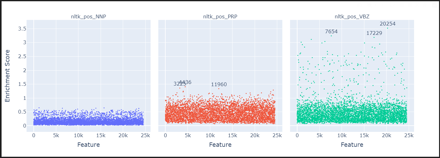
- "nltk_pos_PRP": 인칭대명사(personal pronouns) 토큰을 의미합니다. 예: "he", "she", "it", "they" 등.
- "nltk_pos_VBZ": 동사 3인칭 단수형(3rd person singular present verb) 토큰을 의미합니다. 예: "is", "has", "runs", "goes" 등.
- "nltk_pos_NNP": 고유명사(proper noun) 토큰을 의미합니다. 예: "John", "London", "Google" 등.
token_sets_index = ["nltk_pos_VBN", "nltk_pos_VBG", "nltk_pos_VB", "nltk_pos_VBD"]
token_set_selected = {
    k: set(v) for k, v in all_token_sets.items() if k in token_sets_index
}
df_enrichment_scores = get_enrichment_df(
    dec_projection_onto_W_U, features_ordered_by_skew, token_set_selected
)
manhattan_plot_enrichment_scores(df_enrichment_scores).show()
token_sets_index = ["nltk_pos_WP", "nltk_pos_RBR", "nltk_pos_WDT", "nltk_pos_RB"]
token_set_selected = {
    k: set(v) for k, v in all_token_sets.items() if k in token_sets_index
}
df_enrichment_scores = get_enrichment_df(
    dec_projection_onto_W_U, features_ordered_by_skew, token_set_selected
)
manhattan_plot_enrichment_scores(df_enrichment_scores).show()
token_sets_index = ["a", "e", "i", "o", "u"]
token_set_selected = {
k: set(v) for k, v in all_token_sets.items() if k in token_sets_index
}
df_enrichment_scores = get_enrichment_df(
dec_projection_onto_W_U, features_ordered_by_skew, token_set_selected
)
manhattan_plot_enrichment_scores(df_enrichment_scores).show()token_sets_index = ["negative_words", "positive_words"]
token_set_selected = {
k: set(v) for k, v in all_token_sets.items() if k in token_sets_index
}
df_enrichment_scores = get_enrichment_df(
dec_projection_onto_W_U, features_ordered_by_skew, token_set_selected
)
manhattan_plot_enrichment_scores(df_enrichment_scores).show()fig = px.scatter(
df_enrichment_scores.apply(lambda x: -1 * np.log(1 - x))
.T.reset_index()
.rename(columns={"index": "feature"}),
x="negative_words",
y="positive_words",
marginal_x="histogram",
marginal_y="histogram",
labels={
"starts_with_space": "Starts with Space",
"starts_with_capital": "Starts with Capital",
},
title="Enrichment Scores for Starts with Space vs Starts with Capital",
height=800,
width=800,
hover_name="feature",
)
# reduce point size on the scatter only
fig.update_traces(marker=dict(size=2), selector=dict(mode="markers"))
fig.show()token_sets_index = ["contains_close_bracket", "contains_open_bracket"]
token_set_selected = {
k: set(v) for k, v in all_token_sets.items() if k in token_sets_index
}
df_enrichment_scores = get_enrichment_df(
dec_projection_onto_W_U, features_ordered_by_skew, token_set_selected
)
manhattan_plot_enrichment_scores(df_enrichment_scores).show()token_sets_index = [
"1910's",
"1920's",
"1930's",
"1940's",
"1950's",
"1960's",
"1970's",
"1980's",
"1990's",
"2000's",
"2010's",
]
token_set_selected = {
k: set(v) for k, v in all_token_sets.items() if k in token_sets_index
}
df_enrichment_scores = get_enrichment_df(
dec_projection_onto_W_U, features_ordered_by_skew, token_set_selected
)
manhattan_plot_enrichment_scores(df_enrichment_scores).show()token_sets_index = ["positive_words", "negative_words"]
token_set_selected = {
k: set(v) for k, v in all_token_sets.items() if k in token_sets_index
}
df_enrichment_scores = get_enrichment_df(
dec_projection_onto_W_U, features_ordered_by_skew, token_set_selected
)
manhattan_plot_enrichment_scores(df_enrichment_scores, label_threshold=0.98).show()token_sets_index = ["boys_names", "girls_names"]
token_set_selected = {
k: set(v) for k, v in all_token_sets.items() if k in token_sets_index
}
df_enrichment_scores = get_enrichment_df(
dec_projection_onto_W_U, features_ordered_by_skew, token_set_selected
)
manhattan_plot_enrichment_scores(df_enrichment_scores).show()tmp_df = df_enrichment_scores.apply(lambda x: -1 * np.log(1 - x)).T
color = (
W_U_stats_df_dec.sort_values("skewness", ascending=False)
.head(5000)["skewness"]
.values
)
fig = px.scatter(
tmp_df.reset_index().rename(columns={"index": "feature"}),
x="boys_names",
y="girls_names",
marginal_x="histogram",
marginal_y="histogram",
# color = color,
labels={
"boys_names": "Enrichment Score (Boys Names)",
"girls_names": "Enrichment Score (Girls Names)",
},
height=600,
width=800,
hover_name="feature",
)
# reduce point size on the scatter only
fig.update_traces(marker=dict(size=3), selector=dict(mode="markers"))
# annotate any features where the absolute distance between boys names and girls names > 3
for feature in df_enrichment_scores.columns:
if abs(tmp_df["boys_names"][feature] - tmp_df["girls_names"][feature]) > 2.9:
fig.add_annotation(
x=tmp_df["boys_names"][feature] - 0.4,
y=tmp_df["girls_names"][feature] + 0.1,
text=f"{feature}",
showarrow=False,
)
fig.show()특정 특징 깊이 탐구하기
이러한 강화 분석을 수행할 때, 나는 다음 함수를 사용하여 카테고리별로 logit 가중치 히스토그램을 생성합니다. 그룹화할 카테고리가 df_enrichment_scores의 열에 있는지 확인하는 것이 중요합니다.
for category in ["boys_names"]:
    plot_top_k_feature_projections_by_token_and_category(
        token_set_selected,
        df_enrichment_scores,
        category=category,
        dec_projection_onto_W_U=dec_projection_onto_W_U,
        model=model,
        log_y=False,
        histnorm=None,
    )

부록 결과: 모든 레이어에 대한 Logit 가중치 분포 통계
W_U_stats_df_dec_all_layers = get_all_stats_dfs(
    gpt2_small_sparse_autoencoders, gpt2_small_sae_sparsities, model, cosine_sim=True
)

display(W_U_stats_df_dec_all_layers.shape)
display(W_U_stats_df_dec_all_layers.head())
# Let's plot the percentiles of the skewness and kurtosis by layer
tmp_df = W_U_stats_df_dec_all_layers.groupby("layer")["skewness"].describe(
    percentiles=[0.01, 0.05, 0.10, 0.25, 0.5, 0.75, 0.9, 0.95, 0.99]
)
tmp_df = tmp_df[["1%", "5%", "10%", "25%", "50%", "75%", "90%", "95%", "99%"]]

fig = px.area(
    tmp_df,
    title="Skewness by Layer",
    width=800,
    height=600,
    color_discrete_sequence=px.colors.sequential.Turbo,
).show()


tmp_df = W_U_stats_df_dec_all_layers.groupby("layer")["kurtosis"].describe(
    percentiles=[0.01, 0.05, 0.10, 0.25, 0.5, 0.75, 0.9, 0.95, 0.99]
)
tmp_df = tmp_df[["1%", "5%", "10%", "25%", "50%", "75%", "90%", "95%", "99%"]]

fig = px.area(
    tmp_df,
    title="Kurtosis by Layer",
    width=800,
    height=600,
    color_discrete_sequence=px.colors.sequential.Turbo,
)

fig.show()
# let's make a pretty color scheme
from plotly.colors import n_colors

colors = n_colors("rgb(5, 200, 200)", "rgb(200, 10, 10)", 13, colortype="rgb")

# Make a box plot of the skewness by layer
fig = px.box(
    W_U_stats_df_dec_all_layers,
    x="layer",
    y="skewness",
    color="layer",
    color_discrete_sequence=colors,
    height=600,
    width=1200,
    title="Skewness cos(W_U,W_dec) by Layer in GPT2 Small Residual Stream SAEs",
    labels={"layer": "Layer", "skewnss": "Skewness"},
)
fig.update_xaxes(showticklabels=True, dtick=1)

# increase font size
fig.update_layout(font=dict(size=16))
fig.show()

# Make a box plot of the skewness by layer
fig = px.box(
    W_U_stats_df_dec_all_layers,
    x="layer",
    y="kurtosis",
    color="layer",
    color_discrete_sequence=colors,
    height=600,
    width=1200,
    log_y=True,
    title="log kurtosis cos(W_U,W_dec) by Layer in GPT2 Small Residual Stream SAEs",
    labels={"layer": "Layer", "kurtosis": "Log Kurtosis"},
)
fig.update_xaxes(showticklabels=True, dtick=1)

# increase font size
fig.update_layout(font=dict(size=16))
fig.show()
# scatter
fig = px.scatter(
    W_U_stats_df_dec_all_layers[W_U_stats_df_dec_all_layers.log_feature_sparsity >= -9],
    # W_U_stats_df_dec_all_layers[W_U_stats_df_dec_all_layers.layer == 8],
    x="skewness",
    y="kurtosis",
    color="std",
    color_continuous_scale="Portland",
    hover_name="feature",
    # color_continuous_midpoint = 0,
    # range_color = [-4,-1],
    log_y=True,
    height=800,
    # width = 2000,
    # facet_col="layer",
    # facet_col_wrap=5,
    animation_frame="layer",
)
fig.update_yaxes(matches=None)
fig.for_each_yaxis(lambda yaxis: yaxis.update(showticklabels=True))

# decrease point size
fig.update_traces(marker=dict(size=5))
fig.show()
fig.write_html("skewness_kurtosis_scatter_all_layers.html")
'인공지능 > 자연어 처리' 카테고리의 다른 글
| Hugging face Chat-ui, Vllm으로 챗봇 만들기 (3) | 2024.10.28 |
|---|---|
| ESC task 발표 준비 (0) | 2024.10.08 |
| SAE tutorials - SAE basic (2) | 2024.09.22 |
| SAE 튜토리얼 진행해보기 - training SAE (1) | 2024.09.20 |
| chat bot을 통한 inference 후 chat gpt API를 사용하여 평가하기 (0) | 2024.09.20 |